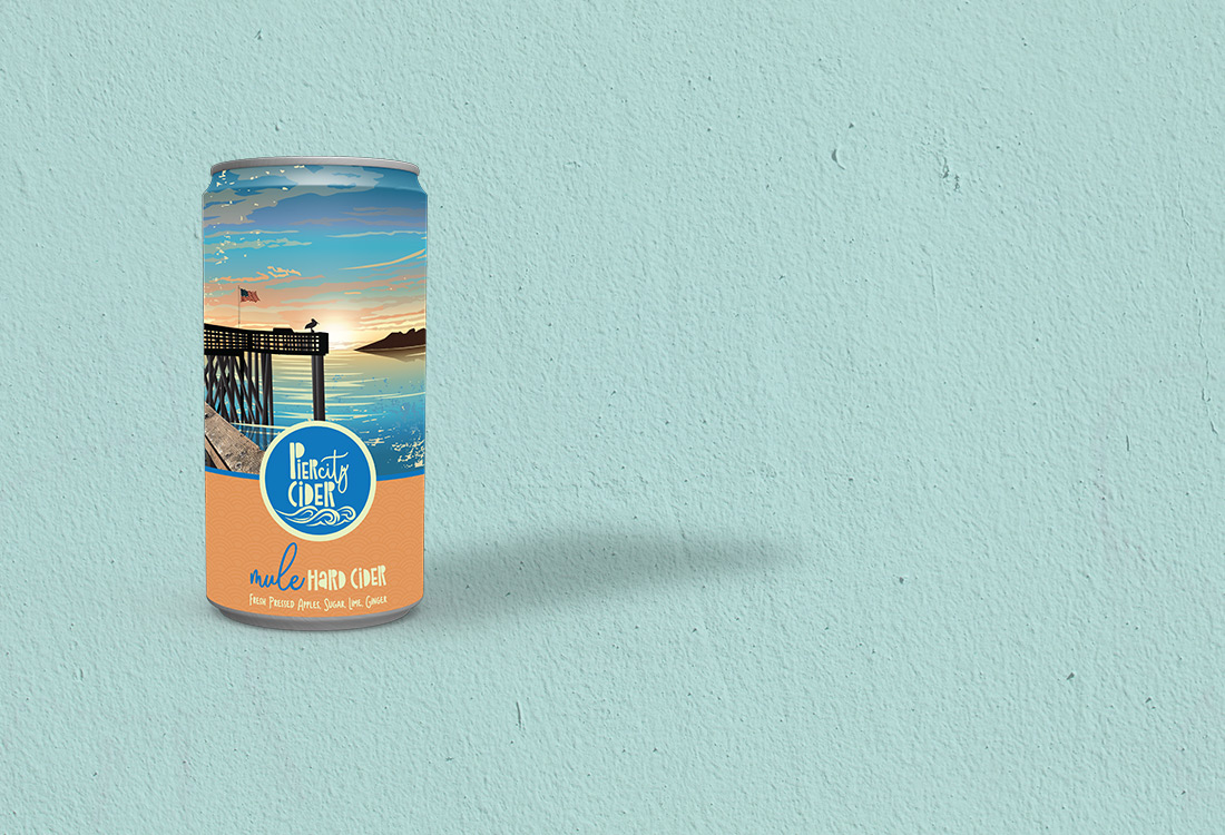
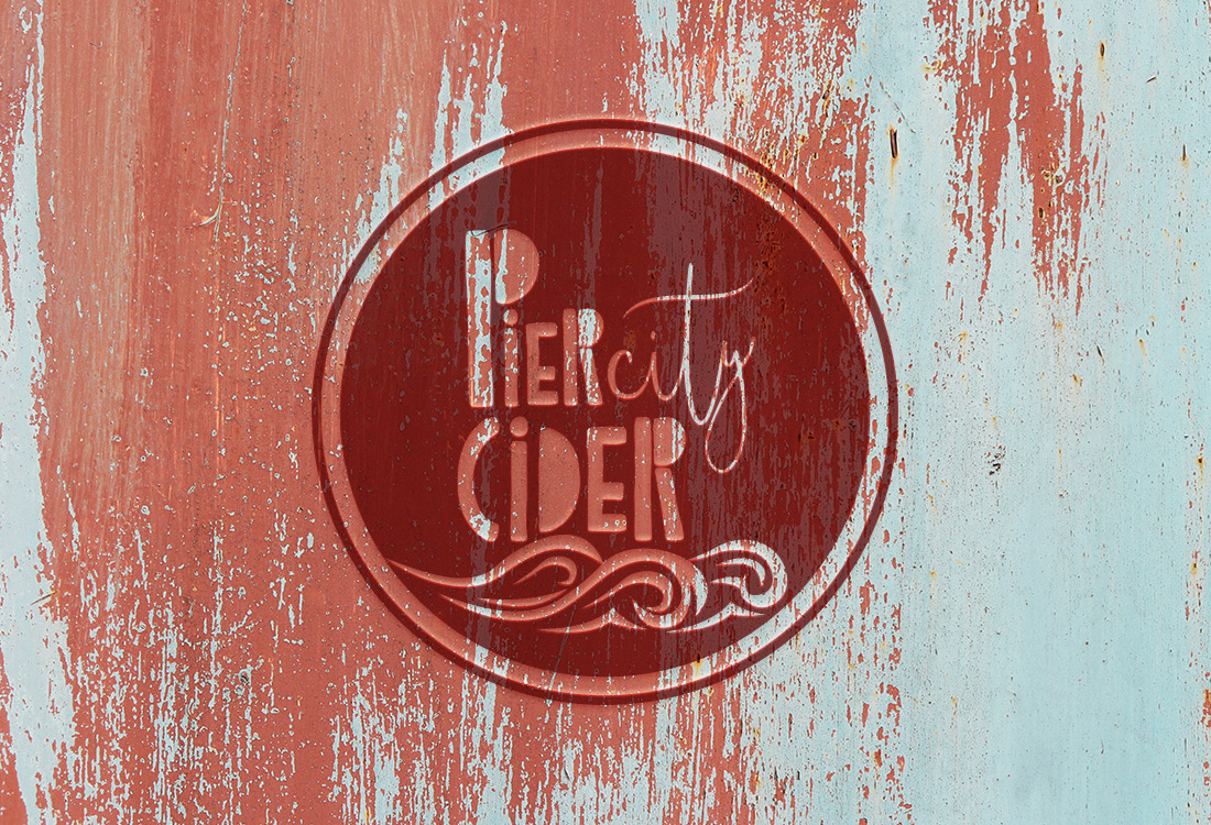
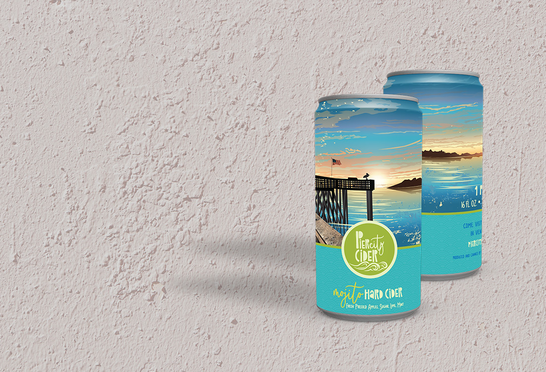
This project has been one of our favorites to date. FRW Studios was originally asked to provide feedback on a logo for a friend of a friend. A winery up in Ventura was starting a line of ciders and they wanted some input on the logo they had created. After providing them with some thoughts, we were asked to re-design the logo and also create the packaging for the entire line. What a treat! First of all, the ciders are DELICIOUS! We had the opportunity to try them and were blown away by their unique and fresh flavors. It was easy to be inspired by what they had created. The goal of this project was to develop a brand that had a clear California surf vibe. The logo needed to be strong and bold. Cider is typically shelved with the craft beer, and being able to stand out is everything. The circle was chosen for easy identity. The font is meant to resemble the pylons of the pier itself with the wave detail adding to that imagery. The city of Ventura has a great pier, so we took a custom photo of that, rendered it into an illustration and then added a beautiful sunset background, flag and pelican details. The script font was chosen for the two flavor choices as a breezy lighter feel to complement the bolder Pier City logo font. This can just makes us want to bring a blanket to the beach, open up a can of cider and let our worries fade with the sunset.
Pier City Cider launched in the summer of 2018.
Follow them at www.piercitycider.com